Web Forms are the easiest and the most effective ways to establish an indirect cordial relationship with your visitors or potential customers. A lead generation form serves as a gateway between your site and its visitors.
Expedia earned additional $1 million annually just by removing one field from their conversion form. Similarly, Marketo earned 34% more leads by experimenting with the length of their web form.
But how do you ensure that the web form is placed in the right corner of your site? How do you ensure that the form is properly optimized for the users?
That’s the biggest challenge for online business owners and internet marketers.
But luckily, we got you covered!
Use inline validation
Inline validation immediately verifies with the users if the data they put in on the form are correct or incorrect.

Using inline form validation effectively increases conversion rates, engagement, and reduces the time taken to fill the form out. It also saves a lot of time and avoids unnecessary frustration on the users’ part.
Use a strong call-to-action
The call-to-action is the tipping point between conversion rate and bounce rate. So, make it catchy and strong to compel people to click it without any second thoughts. It occupies a permanent space in your users’ mind, even once they get off your landing page.
It is better to have buttons that will immediately let your users know what they’re getting. While the “Click Here” button may seem enough, an even better option is to use “Get Free Access” as that instantly provides your users what they’re gonna get after filling out your web form.
But keep in mind that adding in too many buttons can actually lead to a lower conversion rate. So, use buttons on your forms very thoughtfully.
Include a privacy or security statement
A privacy or security line at the bottom of your forms actually help with conversions. It makes your users feel at ease and will remove any doubts that they may have.
Generic statements like “100% privacy assured” may not be the best idea, though. A simple phrase that relates to the product or services that you offer may work. Take the Shopify statement below as an example.

Even if you don’t specifically request for sensitive information from your visitors, having a privacy or security statement on your forms will still help build that trust between you and your users.
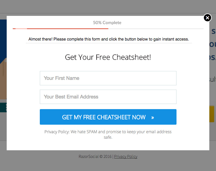
Keep them short and avoid unnecessary fields
Lengthy forms easily deter potential customers. And many of them simply abandon halfway rather than filling them out completely. So, break your long forms into manageable chunks to provide a smoother and better user experience.

Also, keep the number fields as minimal as possible. Like, if your business doesn’t involve actually calling your customers, don’t put a field for their contact number. Minimize your visitors’ efforts for completing and submitting forms on your landing pages.
Promote the form during peak season
To improve your conversion rate using your web form, it is important to target the right audience at the right time. Study your previous campaigns to figure out the perfect peak time to promote your forms on your social media accounts. This is to ensure that you boost your conversion rate and get the most out of the promotion.

Optimize forms for mobile devices
1 out of 3 form submissions comes from a mobile device. So, it is very important to optimize your web forms for mobile viewing and usage.
Make sure that the form itself and all other fields on your form are big enough to be seen and read without the need for the users to constantly zoom in and out. This would also take care of accidentally pressing on something on the form.

Place your forms strategically
The right placement of your form on your landing page will instantly draw your visitors’ attention. This will then lead to a greater conversion rate. Ideally, you should place your form on the sidebar, above the fold, to make it easier for your visitors to see.
The difference between how users treat an above-the-fold and a below-the-fold form is nearly 84%. However, we do advice that you conduct split testing on both to determine which performs the best on your website.
Major brands like CrazyEgg place their form and call-to-action above the fold for maximum impact and high conversion rate.

Bonus Tip
Don’t use Captcha on your web forms. Believe it or not, this actually lessens your conversion rate as some users would rather not go through the extra effort of figuring what is on the Captcha.